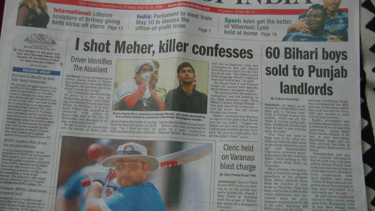
Newspaper Layout Made Simple: Quick Tips for a Clean Look
If you’ve ever flipped through a paper and felt lost, you know a bad layout can ruin the reading experience. The good news? Fixing it is easier than you think. You only need a few solid habits: stick to a grid, prioritize headlines, and keep the visual flow smooth. Below we break down each step so you can redesign a page that feels natural to read.
Start with a Grid – Your Invisible Blueprint
The first rule of any newspaper layout is a grid. Think of it as the skeleton that holds everything together. Most papers use a 6‑ or 8‑column grid because it offers flexibility for photos, sidebars, and long articles. Measure the column width, set gutters (the space between columns), and lock those dimensions in your design program. When everything lines up, the page instantly looks organized and the eye can move from story to story without stumbling.
Don’t overcomplicate the grid. A simple 3‑mm gutter works for most broadsheets, while a tighter 2‑mm gutter might suit a tabloid. Once the grid is set, snap every text box, image, and ad to it. That habit prevents rogue elements that make the page feel chaotic.
Headlines and Hierarchy – Guide the Reader
Headlines are the first thing readers see, so they need to be clear and stand out. Use a larger font size for the main story, a slightly smaller size for sub‑heads, and keep the font family consistent across the page. Bold or a different color can highlight breaking news, but reserve those tricks for true priorities – too much emphasis dilutes impact.
Below the headline, add a short kicker or sub‑headline that gives a teaser. This small line helps the reader decide if they want to dive deeper. Keep it under 12 words and make sure it adds something new, not just repeats the headline.
For body text, stick to a readable serif font at 9‑10 pt for print. Keep line length between 45‑75 characters; longer lines cause eye fatigue, while very short lines look choppy. Adjust leading (the space between lines) to about 120% of the font size – that gives enough breathing room without wasting space.
Images should complement the story, not dominate it. Place a photo close to its related article and caption it with a concise description. If you need a full‑width photo, let the text wrap around it using a narrower column width or a pull‑quote to maintain flow.
Finally, give each page a clear visual rhythm. Alternate text‑heavy sections with image‑rich ones, and use white space deliberately. A well‑spaced page feels less cramped and invites the reader to stay longer.
By applying a solid grid, setting a clear hierarchy, and respecting spacing, you can turn any cluttered newspaper page into a clean, easy‑to‑read layout. Try these steps on your next edition and watch how quickly the reader’s eye finds the story they want.
In the Times of India, the editorial page is typically located towards the middle of the newspaper. It's where the editors express their views on various topics, providing insights and opinions. It's a significant section as it houses thought-provoking articles and commentaries. Over the years, it's been a platform for intellectuals to voice their perspectives. So next time, when you grab your Times of India, don't forget to check out this important section.
